The Driftwood Decor Mistake: When One Texture Takes Over
Driftwood decor feels more convincing when weathered wood has room to contrast with paint, stone, linen and clear space, rather than covering every surface.
The most common driftwood decor mistake is treating weathered wood as a coastal setting in itself. A room crowded with grey, rough-sawn objects can lose the very quality it is meant to evoke: the varied textures of a shore. The wood becomes visual noise, and details that might once have suggested tide, salt and time blur into one another.
A more convincing room gives driftwood a supporting role. Put it beside materials that differ in colour, finish and scale, and its irregular grain becomes easier to notice. Restraint is not about making a coastal interior sparse or precious; it is about letting each material say something distinct.
Why does driftwood decor feel convincing at first?
Weathered wood carries visible signs of change. Its softened edges, muted colour and uneven surface can recall timber exposed to sun, wind and water. Even a small piece—a bowl, frame or short length mounted as an object—may suggest a shoreline more readily than a polished ornament with a generic nautical motif.
That appeal makes repetition tempting. A driftwood mirror, table, lamp base and collection of small ornaments seem to build a clear theme. Yet the eye reads repeated rough, grey-brown surfaces as a single field. The objects no longer register as separate finds; their shared texture dominates the room.
Coastal character is rarely made from one material alone. A shore brings together pale sand, dark rock, smooth pebbles, wet and dry surfaces, plants and built edges. In a room, contrast can suggest that variety without imitating a beach literally. A weathered timber detail gains presence against a painted wall or a smooth ceramic surface precisely because those neighbours behave differently.
What happens when one texture takes over?
When rough, pale wood appears on too many large surfaces, it can flatten a room. The eye has little change of pace: grain repeats, edges repeat, and each object competes for attention in much the same way. Even distinctive pieces become harder to read because none is given a visual pause.
There is also a difference between a material that looks weathered and one that feels considered. If every item has distressed edges or a washed finish, the room can seem deliberately aged rather than shaped by its setting. A single contrasting piece—a crisp linen curtain, a dark metal hook or a glazed bowl—can make the weathering look more particular, not less coastal.
Scale matters, too. A small driftwood object can offer a close-up of texture; a bulky timber feature may set the room’s whole visual weight. Several large pieces with similar colour and roughness are more likely to merge than a group of modest accents separated by plain surfaces. The question is not simply how much wood is present, but how much visual attention it occupies.
How can contrast make weathered wood easier to see?
Think in terms of differences a person can actually notice. Pair rough with smooth, matte with softly reflective, pale with deep, or irregular with clean-lined. Contrast need not mean a dramatic colour scheme. A chalky painted wall beside a warm timber surface, or a simple glass vessel beside a weathered frame, may provide enough separation for both materials to register.
Useful coastal companions include:
- Linen or cotton: Their soft folds contrast with hard, split grain.
- Ceramic: A glazed surface gives the eye a calmer, more continuous plane.
- Stone: A smooth pebble or simple stoneware piece offers a different kind of natural irregularity.
- Painted timber: A clean, even finish distinguishes a built surface from a weathered accent.
- Glass: Its clarity can lighten a grouping without adding another rough texture.
- Metal: A restrained dark or brushed finish can sharpen the outline of a pale wood object.
These are not ingredients to collect in equal measure. Choose one or two contrasts that answer the room’s existing conditions. A cool, pale room may need a little warmth; a room already full of visual detail may benefit more from a quiet surface than another decorative object.
How much driftwood belongs in a room?
There is no fixed count that suits every room. A better guide is whether each piece has a clear job. It might bring an irregular line to a plain wall, introduce a naturally worn surface near a smooth table, or provide a focal detail in a restrained arrangement. If several pieces perform the same job in the same area, one may be enough.
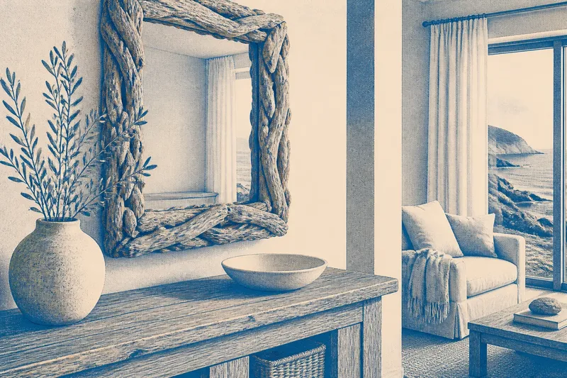
Imagine a sitting room with a driftwood mirror above a console and several small weathered pieces already displayed nearby. The owner removes the smallest objects, leaves the mirror as the main rough-textured feature and places a simple ceramic bowl on the console. The expected result is not a more authentic room by decree; it is a clearer view of the mirror’s grain, with the bowl offering a quiet surface beside it.
Give empty space some weight in the decision. A bare stretch of wall, tabletop or shelf is not a failure to decorate. It separates one textured object from the next, allowing its shape to remain legible. This is especially useful when the wood has a complex silhouette or grain that would disappear in a crowded arrangement.
What should you ask before adding another piece?
Does it add a different shape or just more grain?
Compare its outline with the driftwood already in the room. If both pieces have similar jagged edges and muted colouring, a contrasting silhouette may bring more interest than another weathered surface.
Will its finish stand apart from nearby materials?
Look at the object beside the actual wall, floor or furniture it will meet. A rough timber piece against another distressed surface may merge, while a smooth or painted neighbour can clarify its texture.
Is the object connected to the room’s character?
Consider whether it contributes a useful material, shape or colour relationship rather than simply announcing a coastal theme. If its only role is to repeat a familiar shore-inspired look, leaving it out may make the other details more convincing.
Would moving an existing piece solve the problem?
Try separating similar objects before buying or making something new. A change in spacing can restore distinction, especially when a shelf or console holds several small items with related textures.
Which driftwood details deserve the most attention?
Choose pieces for their visible character, not just their weathered label. Look for an outline that differs from the furniture around it, a grain that remains readable at the distance from which it will be seen, or a colour that connects two otherwise separate parts of the room. One distinctive branch-like form may have more presence than a cluster of similar fragments.
It helps to notice how a piece meets its surroundings. A timber object with a clean-edged ceramic or metal neighbour can make the contrast feel intentional. A highly irregular piece may need a plain wall behind it; a small, subtle piece may need a more deliberate position to avoid vanishing among other details.
There is little value in adding faux wear to every surface to make a room feel more coastal. Distressed finishes can be appropriate when they suit the furniture, but multiplying them does not create the complexity of a shoreline. Nor does every room need shells, rope or a palette of sea colours to make a piece of weathered wood feel at home.
How can a room keep its sense of place?
Use driftwood as evidence of material change, not as a shorthand for the entire coast. Let smooth and rough surfaces, restrained colour shifts and a few clear silhouettes carry the composition. Then the wood can suggest exposure and age without pretending that every part of the room has washed ashore.
For driftwood decor, the useful question is not how many weathered objects a room can hold, but what each one becomes visible beside. A little contrast gives grain, edge and colour room to speak. Keep that principle in view as the room changes, and new coastal details can add character without burying the ones already there.